
Project Summary
Client: ivWatch
Objective:
Develop a brand communication strategy and visual system for blox, a US-based manufacturer of face masks, to address the rise of non-certified and counterfeit N95 masks in the market. The goal was to create a fresh, youthful, and relevant identity that resonated with today’s consumers while standing out in a crowded marketplace.
Role:
Co. Copywriter
Art, Photo, Video Direction
Site UI
Brand Strategy
Visual Identity Design
With counterfeit masks being banned by major retailers, blox needed to establish trust and credibility while appealing to a modern audience. The brand required a unique narrative and visual identity that communicated its value proposition clearly and memorably.
- Crafted a brand voice that was confident, clever, and slightly cocky—balancing humor with authority. The tone was self-assured, knowledgeable, and nuanced, emphasizing the importance of proper mask usage in a way that felt relatable and engaging.
- Developed a visual system that exuded freshness and youthfulness, aligning with current market trends while maintaining a professional edge.
- Focused on storytelling to make the product unique, using a “matter-of-fact” approach to highlight blox’s commitment to quality and safety.
Outcome:
The result was a cohesive brand identity that not only addressed consumer concerns about counterfeit products but also positioned blox as a bold, innovative, and trustworthy choice in the face mask market. The confident yet approachable tone and modern visuals helped blox stand out, ensuring relevance and appeal in a competitive landscape.
My role in crafting blox's
Messaging System
Personification - Tone
Tagline Collaboration
Market Research
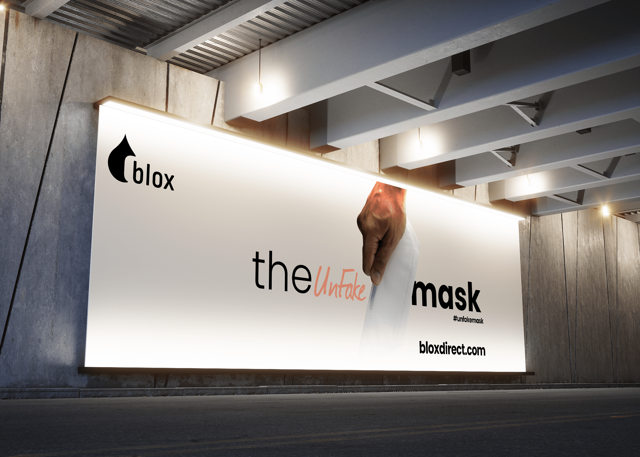
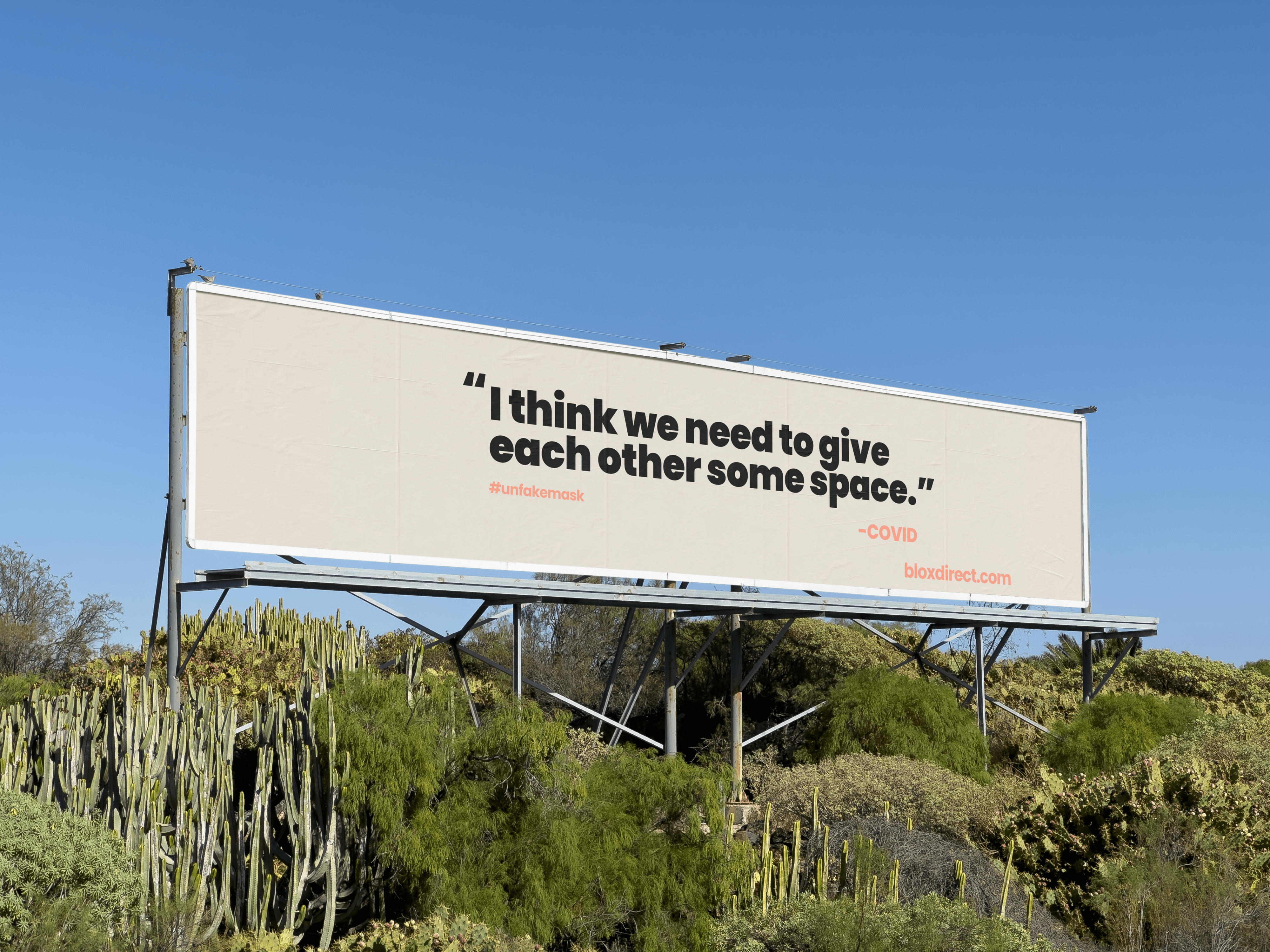
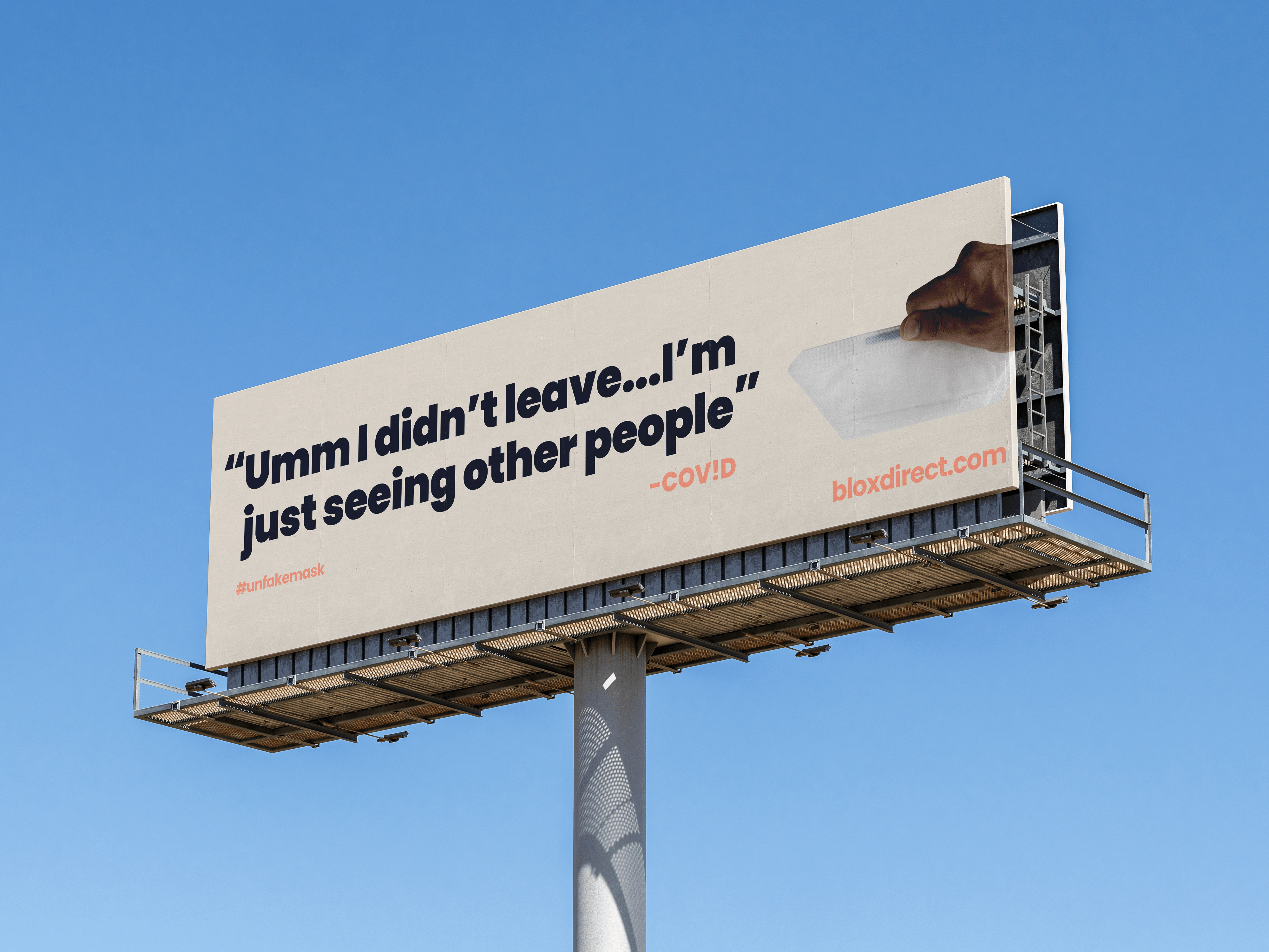
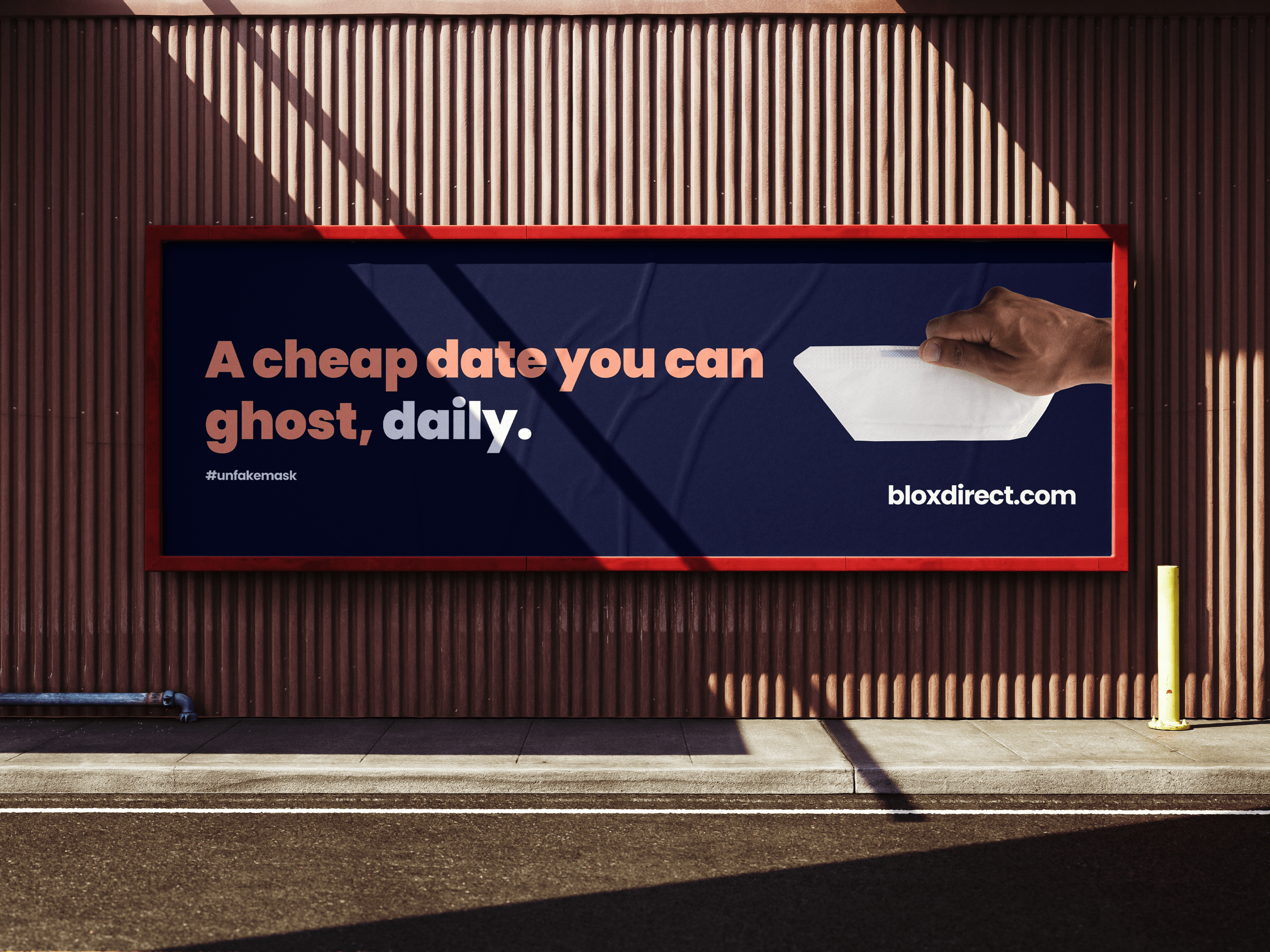
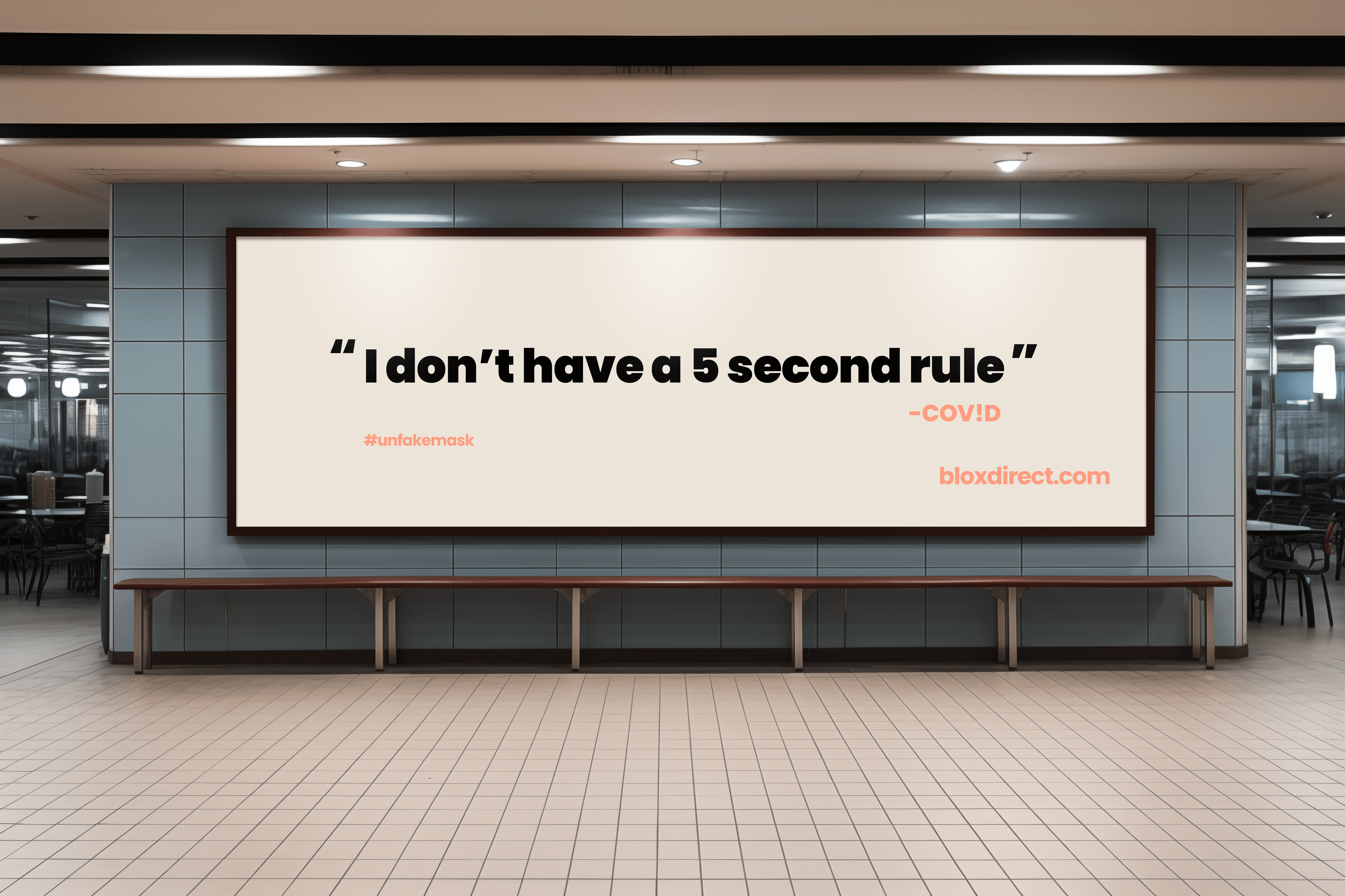
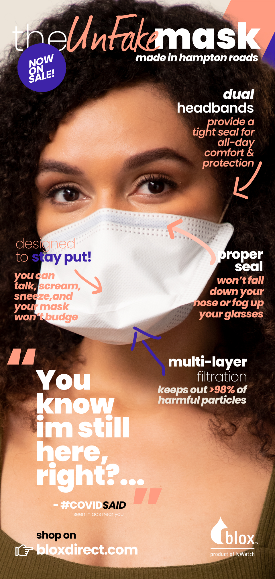
The “UnFake Mask”
Speaks to Blox being a “certified N95 mask” for proper protection and a node to “Fake News” reference
“It may be ugly but, it’s not fake”
It’s no secret that people don’t like wearing a mask for a host of reasons; for most aren’t valid, like:
- “I feel silly”
- “My face is my winning asset and this doesn’t work for me”
- “I don’t feel sick, so why do I need to put on a mask that makes me look sick?”
- “I can’t breathe in this thing, and I am uncomfortable (psychological mental anxiety causing a physical response)”
- “I will wear one when I think I need one”
- We want to create opposing arguments in a very “matter of fact” manner that mocks the behavior yet points out the severity of not participating in proper safety measures.
- We would like to highlight the importance of proper mask usage by illustrating the absurdity of poor use or no use at all. Calling the audience on the bullshit without insulting them yet, narrate it as if the average Joe had the answers.
- Using fact stats in an internalized conversation, from the consumer’s perspective of “kitchen table talk”
- Let’s face it… You won’t win any pageants but, at least, you won’t be a dead contestant
- Ugly But, Alive
- Fits the “bill”… Will it accentuate your features? Maybe. Can it save your life? Yes
- Life over looks (Life > Looks): “Live long enough to talk about how stupid you looked.”
How I created the
blox Brand Expression System
For ivWatch’s blox face mask solutions, the initial brand communication aimed to address concerns about non-certified and counterfeit N95 masks being sold and even banned by major retailers. Blox, a local US manufacturing company, sought a visual system that exuded freshness, youthfulness, and relevance to the current market landscape.
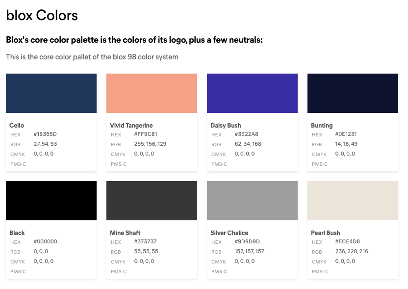
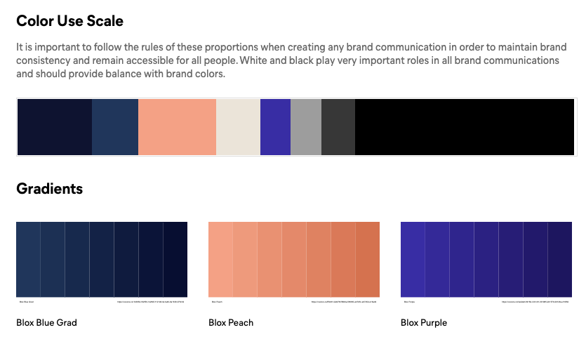
Color & Style
While the parent company, ivWatch, has a distinct design style rooted in a modern medical aesthetic, the challenge with blox was to adapt this for a consumer audience. By leveraging ivWatch’s existing color palette and introducing warm, inviting, and approachable tones, we transformed the clinical aesthetic into one that feels both trustworthy and consumer-friendly. This approach allowed the medical-focused foundation to seamlessly align with a product designed for everyday use, creating a visual identity that bridges professionalism with approachability.
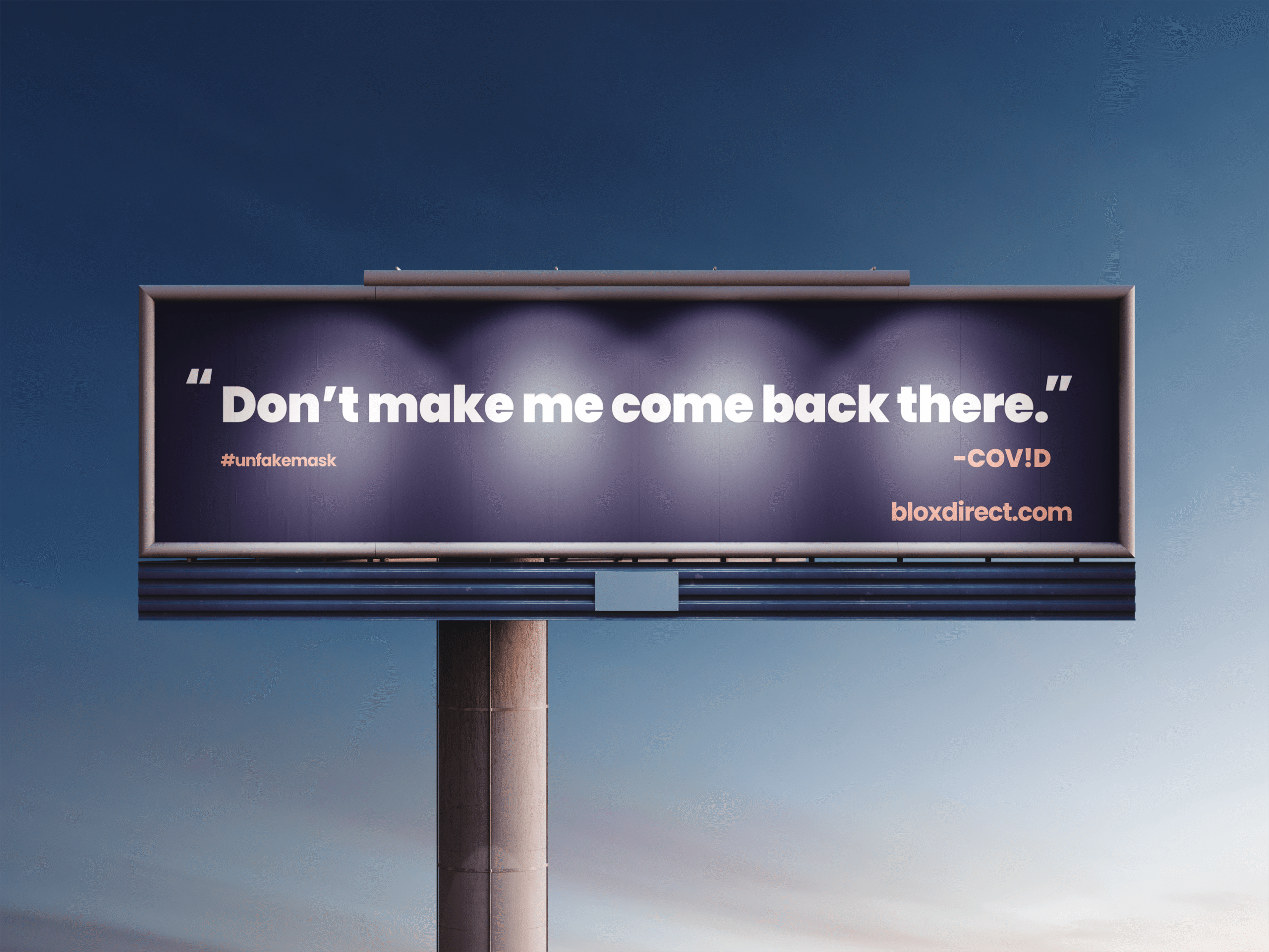
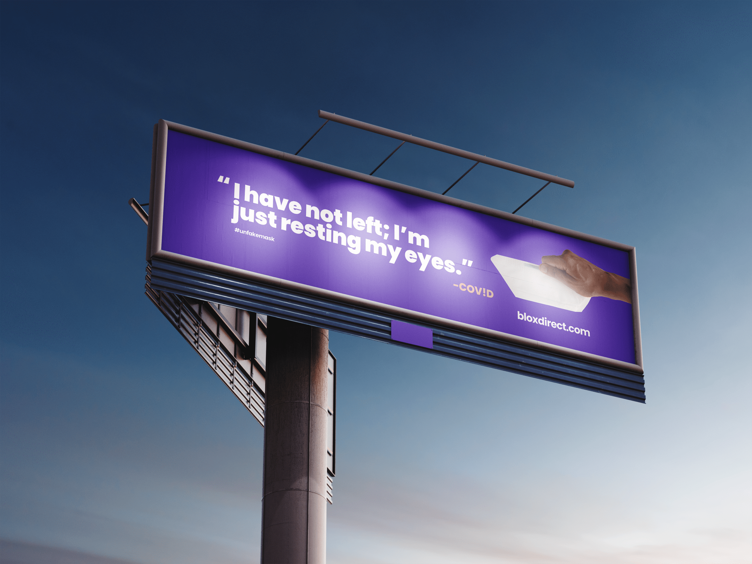
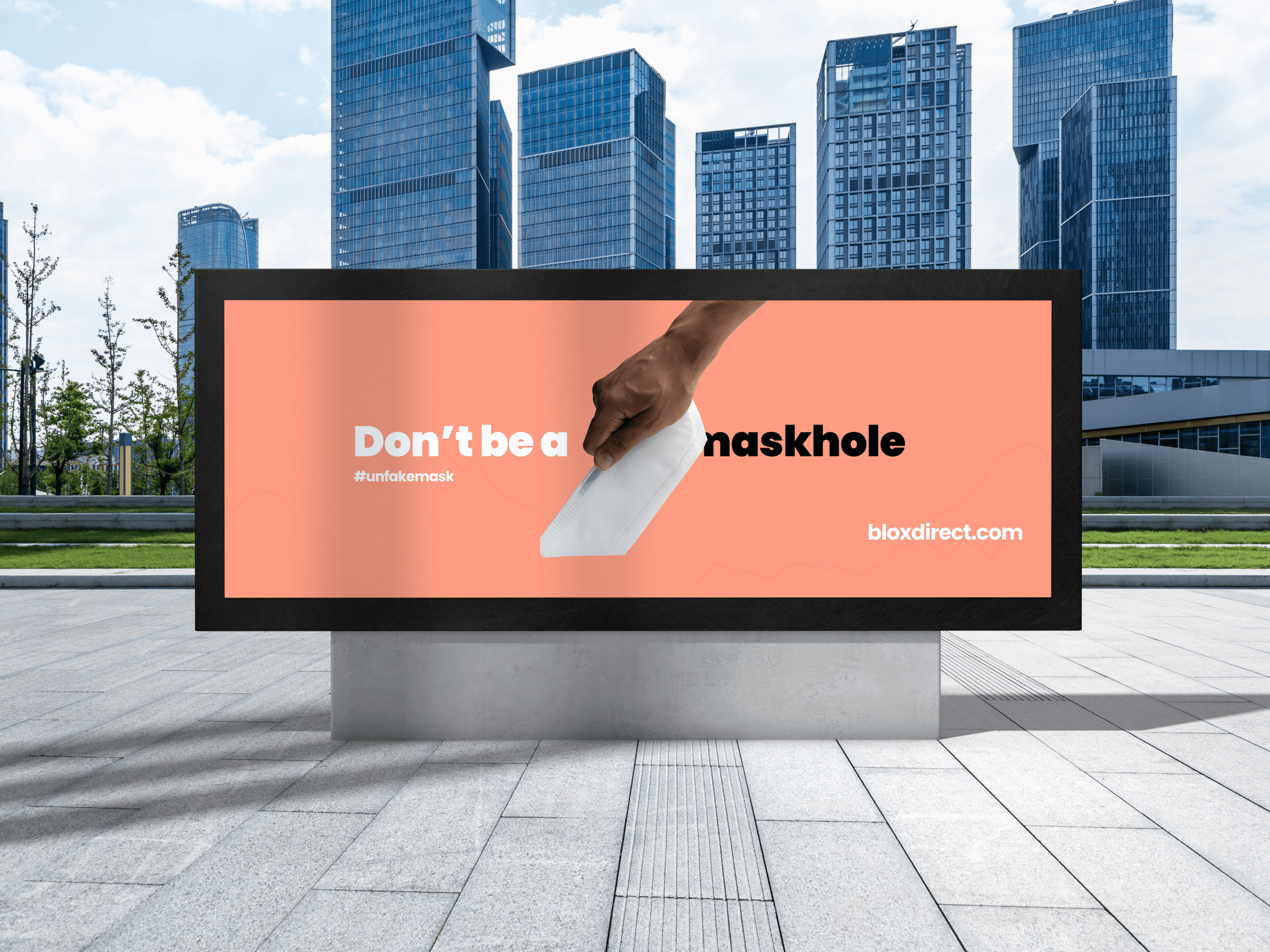
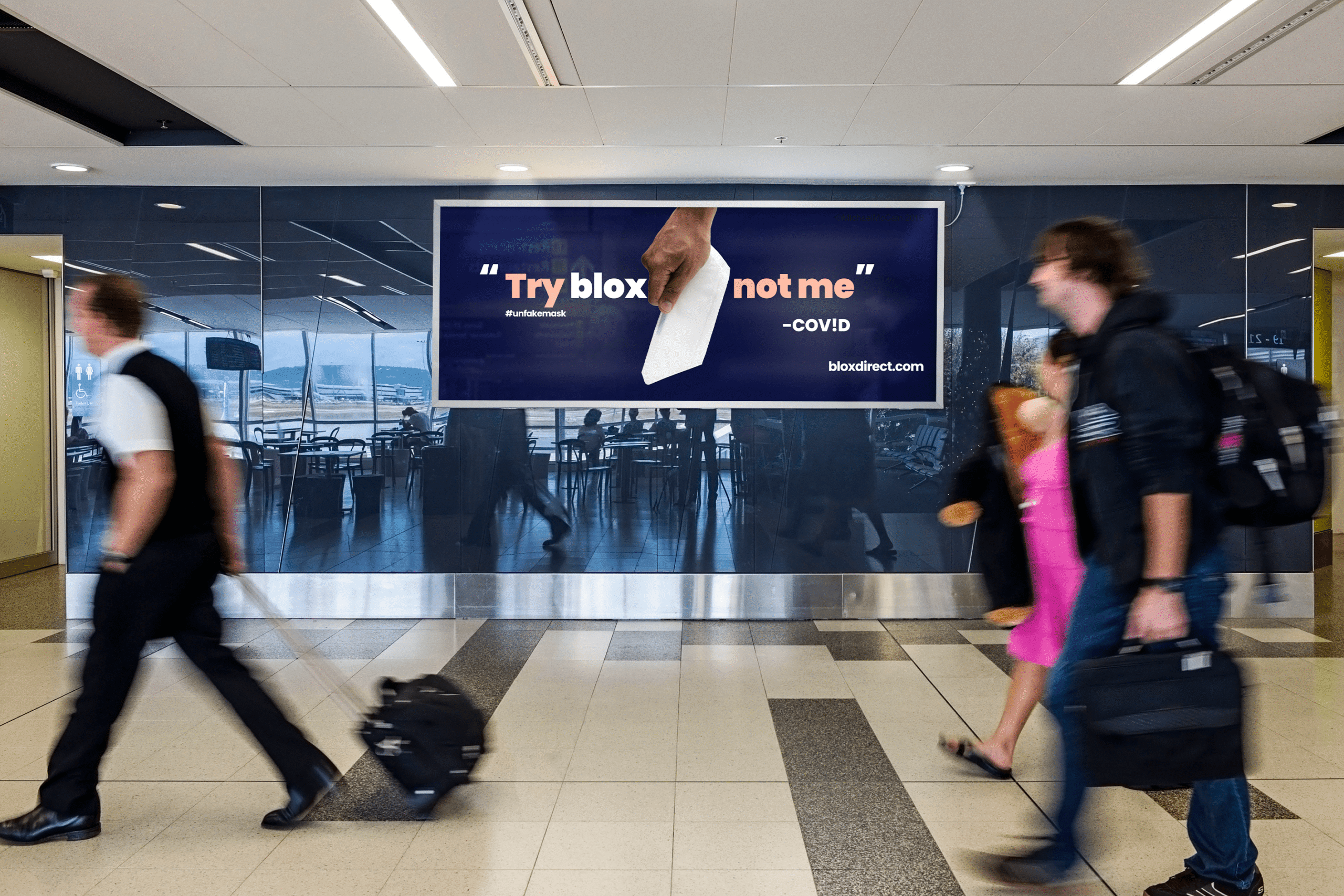
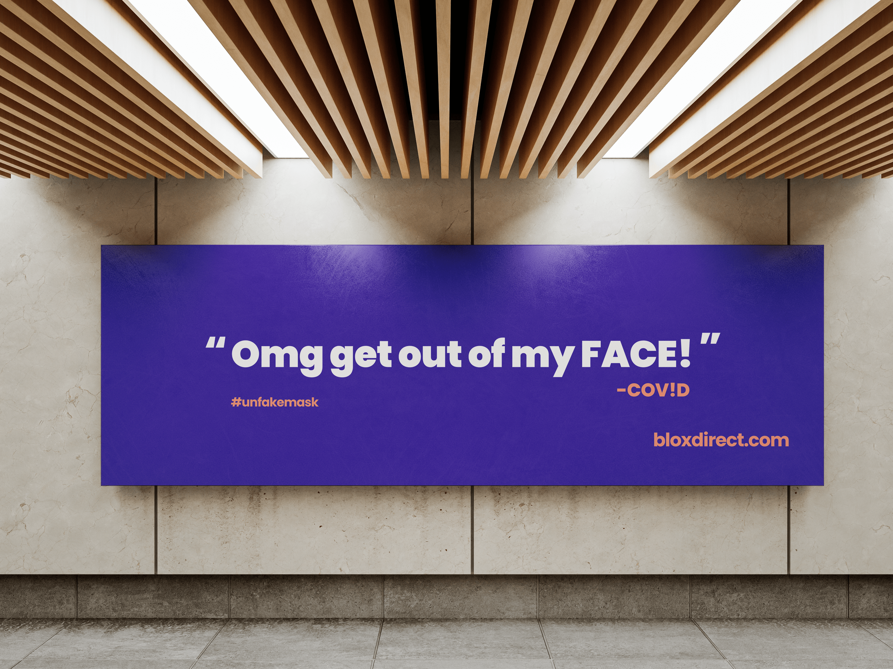
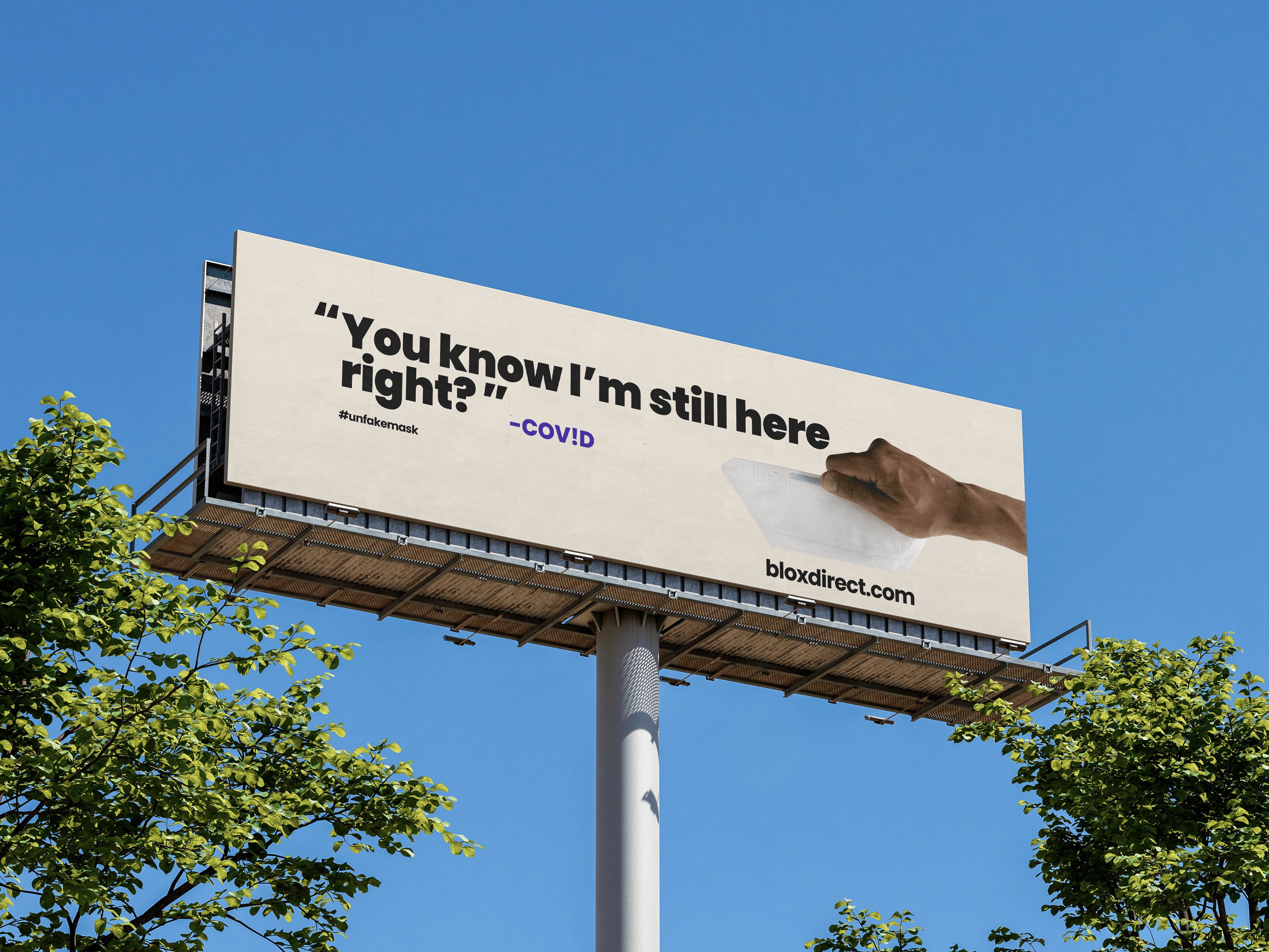
Digital Billboard — Comps
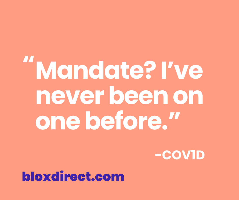
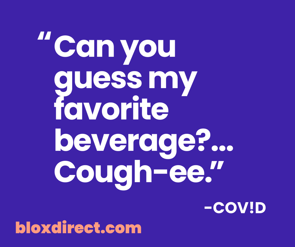
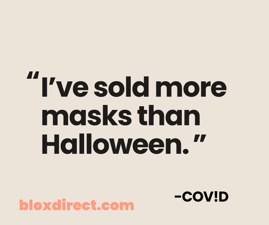
blox by ivWatch aimed to create a concept that would quickly amplify their brand identity and message in a way that could resonate widely and virally. The idea centered on personifying the global pandemic, COVID-19, giving it a voice to engage in a humanized, sometimes lighthearted dialogue about the importance of mask-wearing and the realities of the virus.
I crafted copy, concept, design, and photography for these mock-ups.

Website & Shopify UI
In designing the website, I drew inspiration from competitors in the same space who often prioritized other channels over their online presence. By analyzing their approaches, I crafted a design that emphasized a strong digital identity. The color palette, tone, and voice were carefully curated to reflect a trusted and relatable brand. To further enhance this, I incorporated diverse, situation-based visuals that dynamically conveyed the brand’s versatility and reliability, ensuring the online presence stood out as both engaging and trustworthy.
Built on a managed WordPress platform, the site utilized a versatile template with robust functionality. This allowed us to enhance visual appeal through strategic use of color, animations, and video sliders, all while delivering a seamless and harmonious user experience.


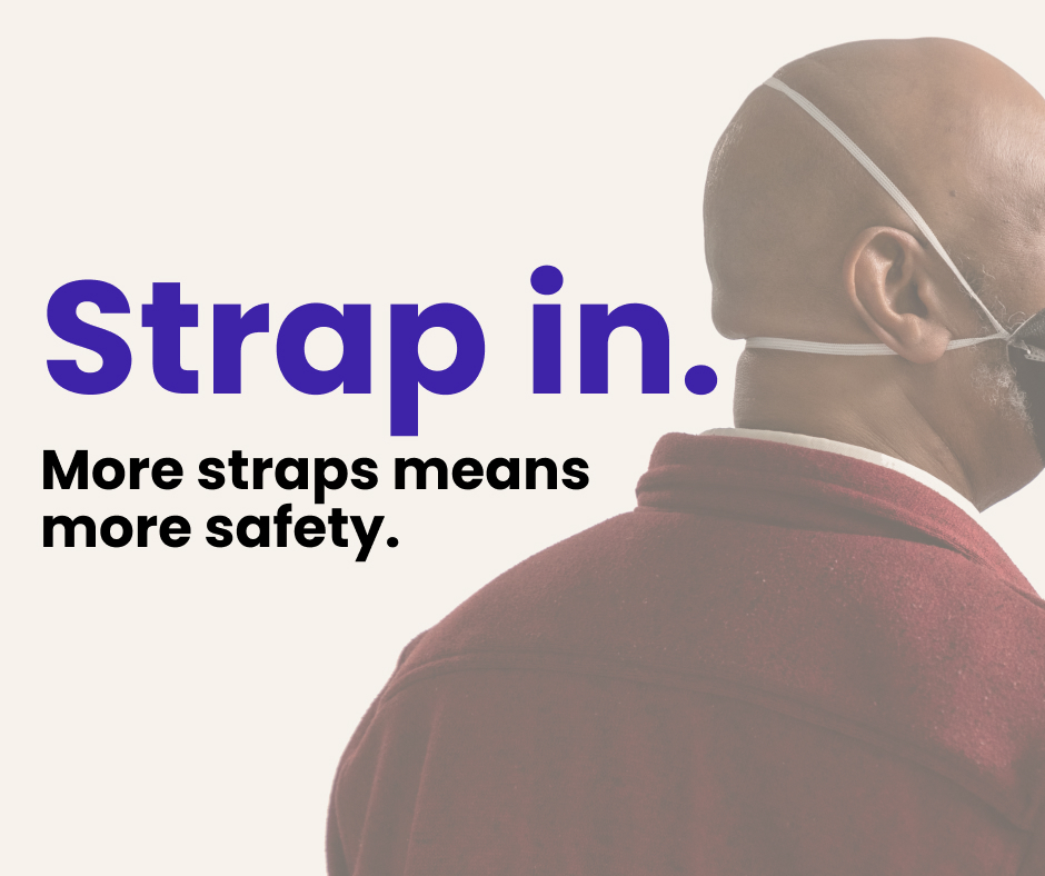


Social Campign Ads
blox Fit Instructions
A key component of this product’s brand identity was the creation of an instructional video showcasing the proper way to wear a blox mask. The video outlined a clear, 7-step process, taking users on a structured journey to ensure they could effectively and confidently use the mask. This approach not only reinforced the brand’s commitment to safety and usability but also provided a practical, user-friendly resource for customers.
Role: Initial Editing, Storyboard, Direction for final post-production
Tools Used: (Intro + Outro) Adobe After Effects, Premiere, Frame.io
Producers: Flagship
Director & Storyboard: Myself — Erin Wendell
Fit Instructions Soundtrack: Tech Landscape
Manufacturing Tour Soundtrack: Inbound—by Brendon Moeller
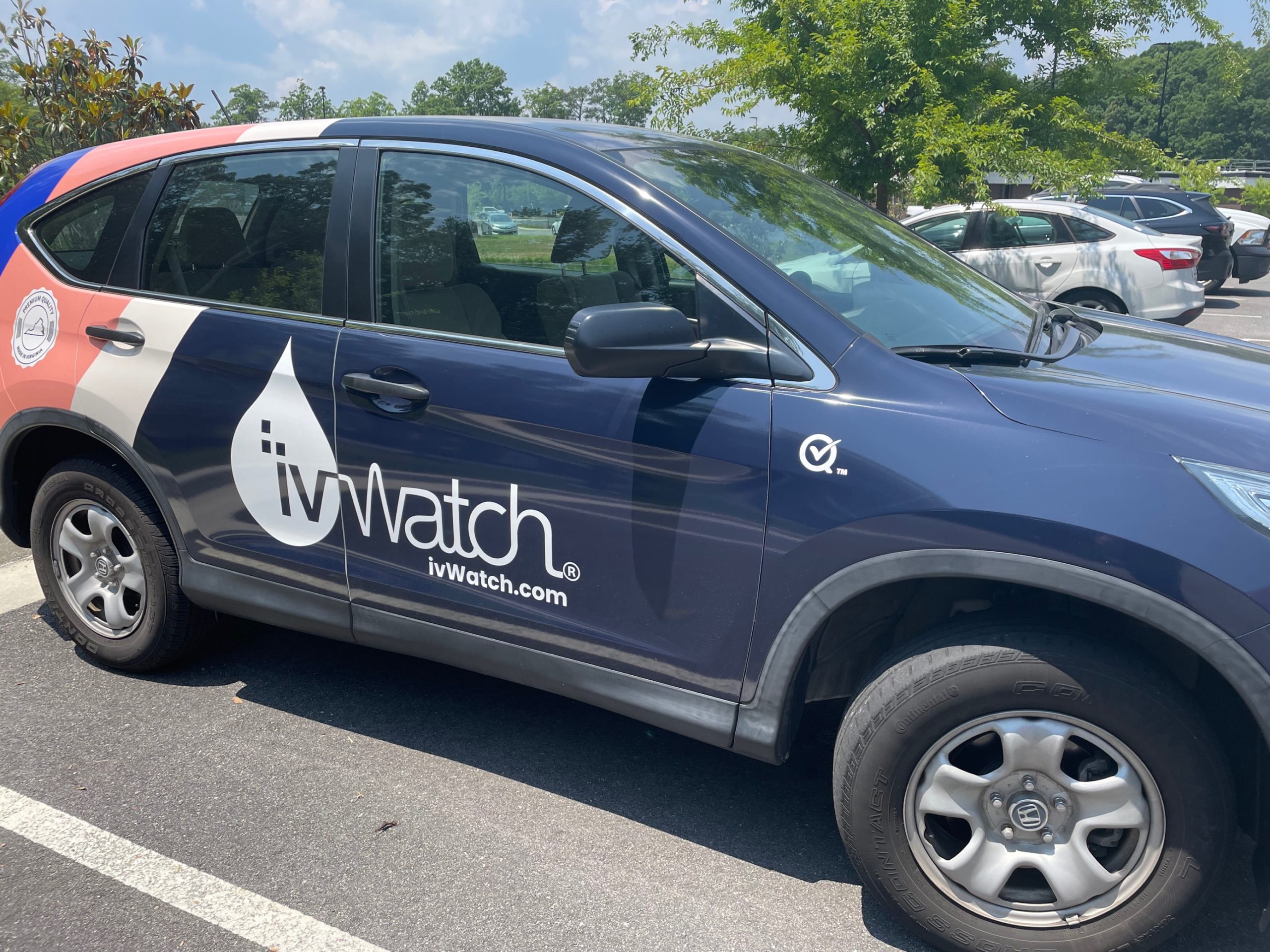
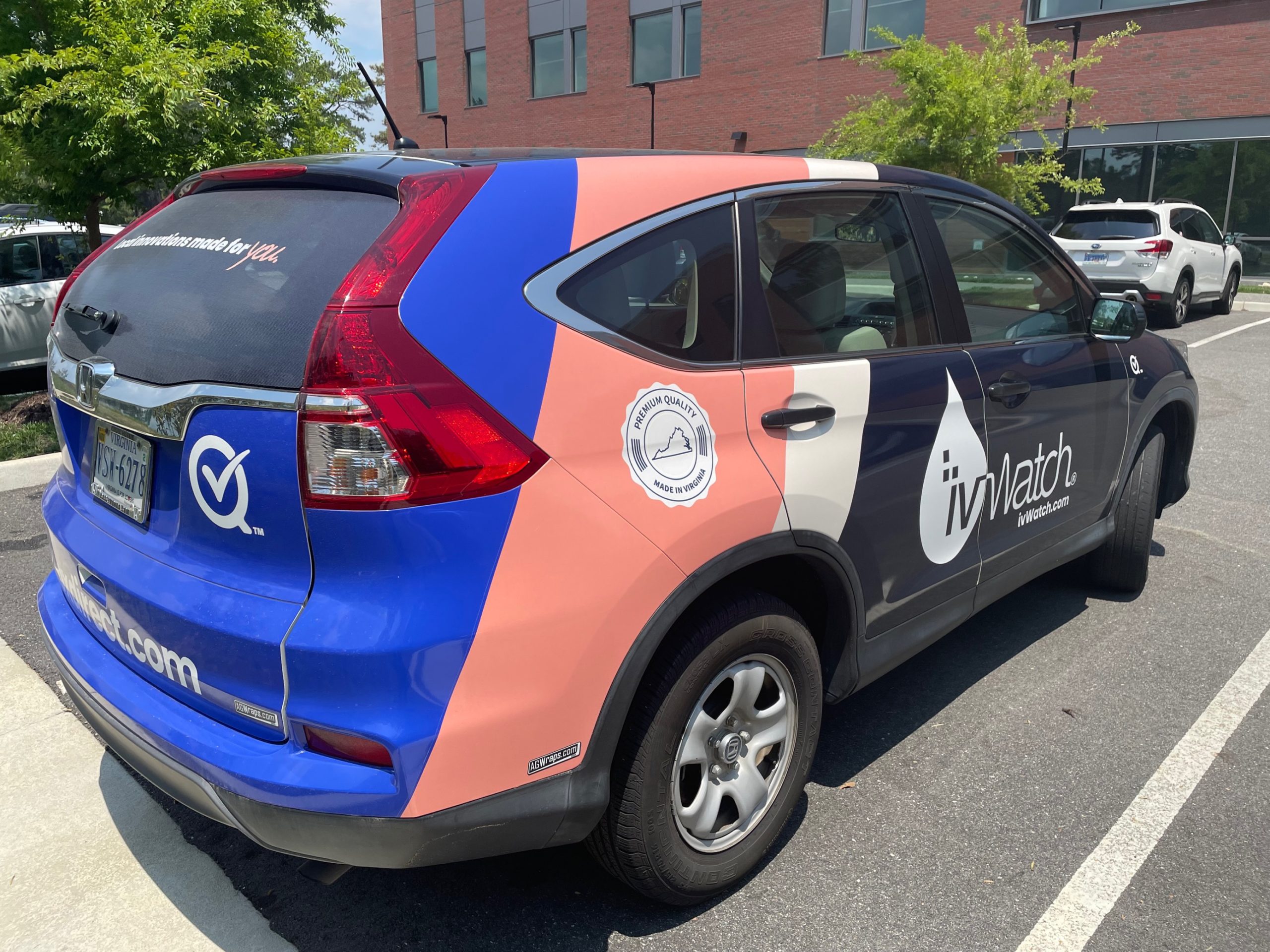
Transportation Vehicle Wrap
A key element of blox’s brand identity was to cultivate a sense of local pride and trust, reinforcing their reliability as a community-rooted brand while expanding their reach. Drawing from the established messaging and color palette, I introduced a retro-modern pattern for the car design. This approach not only infused visual appeal and elevated the brand’s premium feel but also ensured a timeless aesthetic, perfectly suited for the client’s daily travels across Virginia. The design became a moving emblem of blox’s commitment to quality and local connection.
Mockups: Figma
Build: Illustrator