Summary
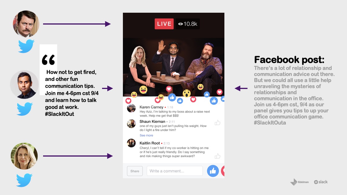
Within this undertaking, Edelman PR presented a comprehensive communications deck to Slack, aimed at advancing their evolving narrative. I harnessed visual elements derived from the brand’s established visual identity and expanded upon these through the unique perspective of Edelman.
Active Role In Project
Presentation Design
Color & Style Direction
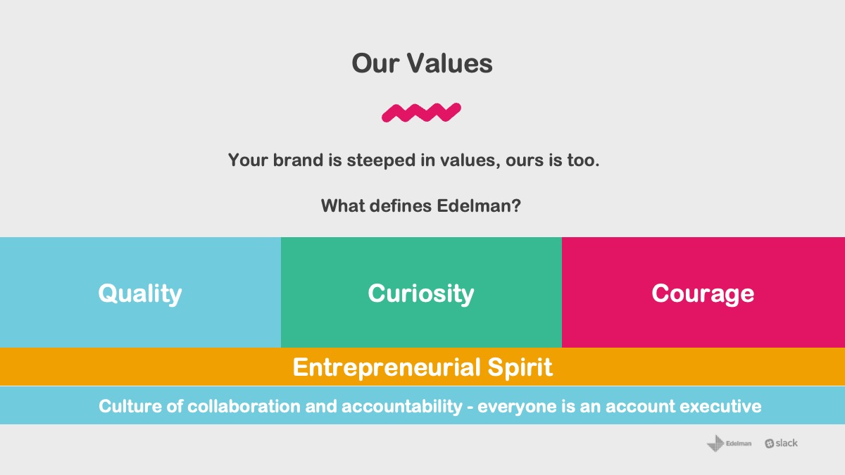
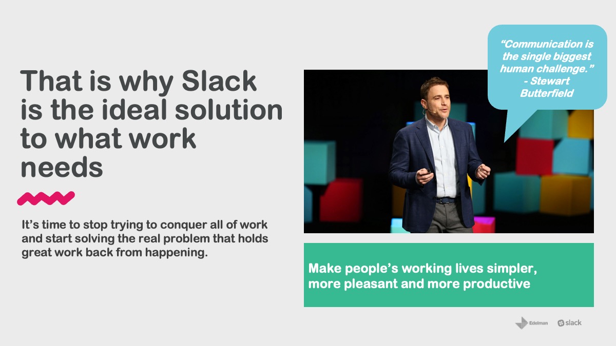
The design aimed to encapsulate the sleek, minimalist color palette and design approach curated by the Character SF team for this tech-oriented robotic company. I employed their color cues to set a stylistic tone that harmonized with the copious amounts of text and captivating layouts, generating visual intrigue for the robotic device.

Style Template
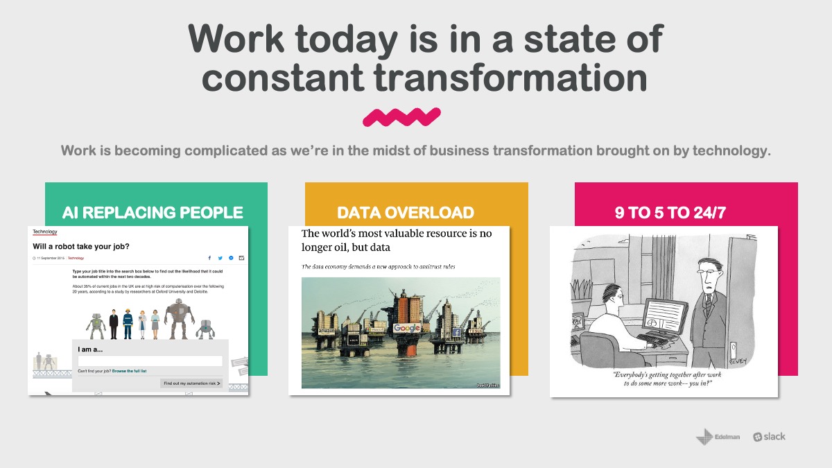
The design template was built using Keynote, streamlining the process for shareholders to seamlessly integrate their raw content and data into refined designs. These designs struck a harmonious balance between the text and the chosen vibrant colors, enriching the visual messaging direction of the expanding brand.
Graphics and Section Pallets
Every chart and graphic was meticulously crafted and tailored within Keynote, enabling leadership to effortlessly refresh company-specific data while upholding a consistent and cohesive visual output aligned with the brand. By embracing the entirety of the brand’s color palette, as opposed to restricting to just 1 or 2 primary colors, Kindred effectively conveyed their brand personality right from the initial point of interaction.


