

No Filter Network UI & ID Development
Summary
Project: NoFilter Network Platform Interface—Revolutionizing Live Experience Creation
Overview:
NoFilter Network is a groundbreaking platform designed for creators passionate about producing dynamic live experiences. The platform empowers users to effortlessly schedule, share, and monetize their events or series, fostering meaningful viewer engagement. With its intuitive interface, NoFilter enables users to produce and stream 4K content with the finesse of professional creators.
Role: Creative UX/UI Design Lead
Tools & Technologies:
WebRTC, Sketch, Adobe Creative Suite, User Testing Platforms
- Delivered a cohesive brand identity that resonates with the platform’s target audience of ambitious creators.
- Designed a user-friendly interface that simplifies complex functionalities, enabling users to focus on content creation.
- Enhanced the streaming environment to support 4K content, ensuring a premium viewing experience for audiences.
- Brand Identity Enhancement: Redefined the visual and tonal identity of No Filter Network to reflect its innovative and user-centric ethos.
- UI/UX Design: Overhauled the prelaunch beta interface, focusing on seamless navigation and an engaging user experience.
- Streaming Environment Optimization: Elevated the WebRTC-powered streaming interface to ensure high-quality, professional-grade live streaming.
NoFilter Network’s refined brand identity and intuitive design have positioned it as a go-to platform for creators seeking to elevate their live-streaming capabilities. The platform’s seamless user experience and professional-grade tools have set a new standard in the live experience creation space.
Brand ID
My active role
Illustration - Typography
Iconography
Proposed Identity


ID Mark


Mobile Button
Color Story
My active role
Color Scheming
Style Research
WCAG Compliance
My active role in
NoFilter.net Platfrom
Site Mapping - Planning
Style Research
Storyboarding - Planning
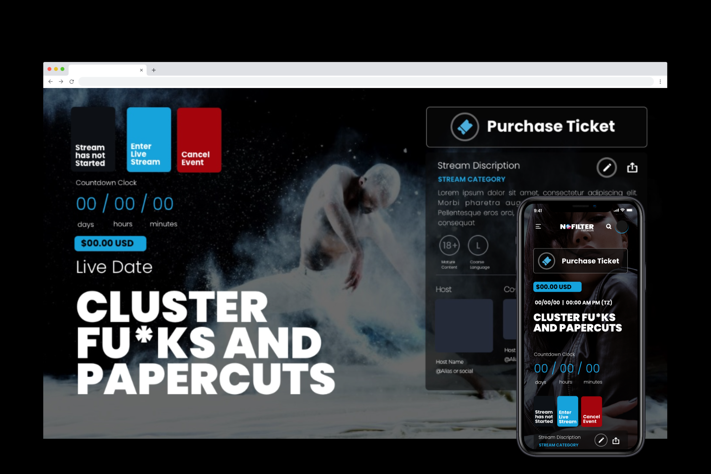
Monetized Features
The project’s scope expanded to address a critical gap in the initial beta platform: the lack of a monetized UX function, which hindered users from maximizing the value of their recorded content. To align with the client’s vision, I led the team in strategizing and implementing key site enhancements. We conceptualized and mapped out new functionalities, collaborating closely with developers to bring “modal features” to life. These innovative additions enriched the user experience and enabled the platform to scale its business model, paving the way for sustainable growth.
My role in creating
The Scheduler
Style / UX Research
UX - Storyboarding
Prototyping - UI
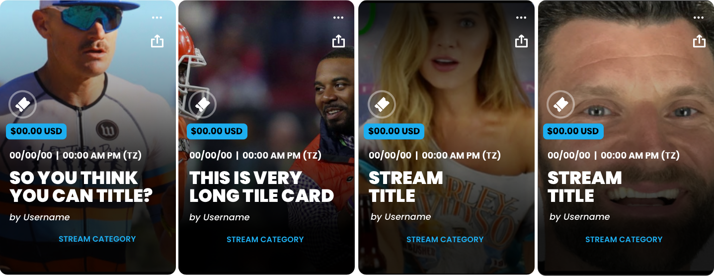
Self Published show card
My active role
Style / UX Research
UX - Storyboarding
Prototyping - UI
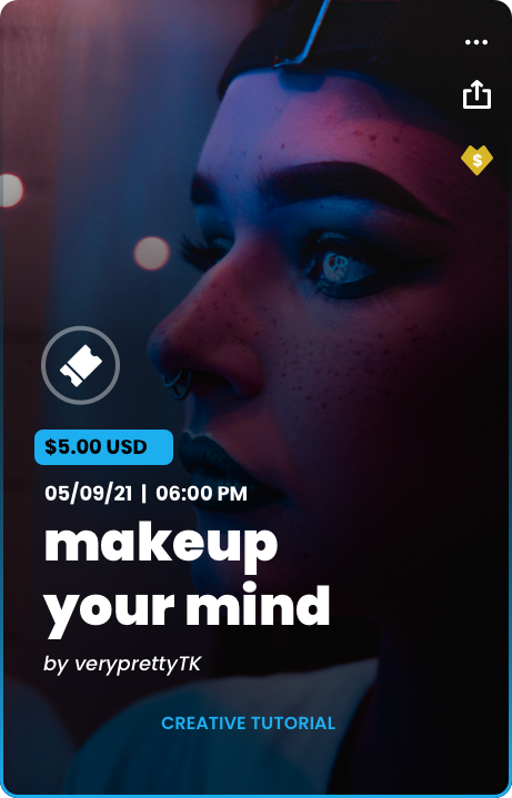
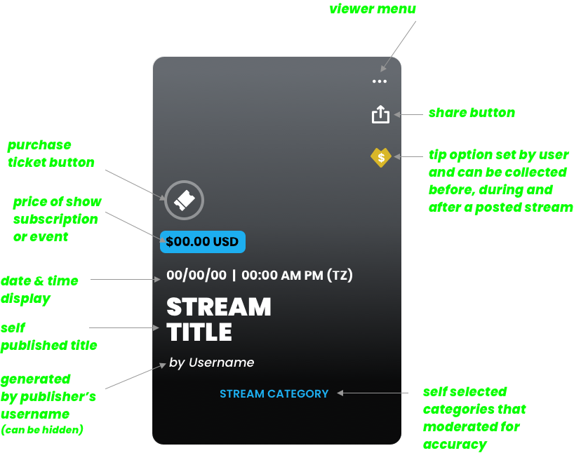
My role in creating NF's
Vanity Link
UX - Storyboarding
Prototyping - UI
Tips
The Tip Feature reimagines the traditional “like button,” shifting focus to content enthusiasts who actively support creators through financial contributions. This innovative approach fosters ongoing content creation and empowers creators with tangible resources. Seamlessly integrated into the platform, the feature is accessible via the creator’s “Show Card” (visible before, during, and after shows), their bio section, and during live streams, ensuring maximum visibility and engagement.

Concept pitch of
Streaming Hub
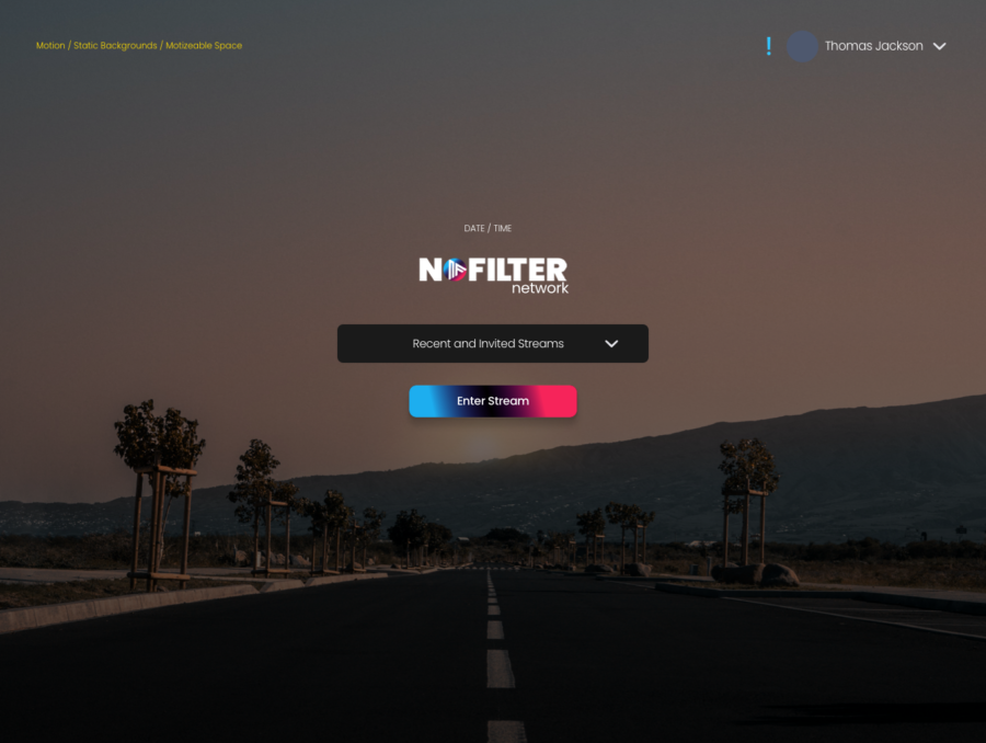
The Streaming Hub was a cornerstone of the network’s second release during the soft launch phase, introduced post-funding. Designed to centralize access for both content creators and viewers, it serves as a unified platform for online streaming content. Fully responsive, the hub seamlessly adapts to desktop, mobile, and TV interfaces. Key features include:
— Simplified login or stream initiation
— Account and user controls
— Content creator controls
— Dashboard management
— Ad/content feature background slider
— Viewer Green Room
— Co-Host Green Holding Room
Re-designed
Live Stream Room
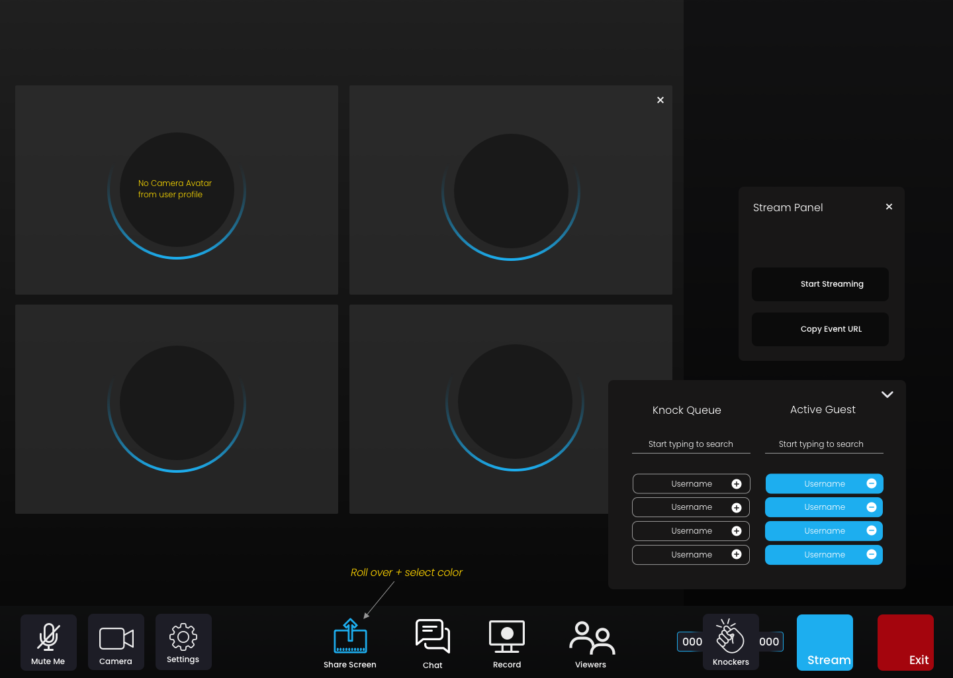
The Live Stream Room was reimagined as a dynamic, multi-functional space for streaming broadcasts, real-time “in-session” communications, and integrated merchandise displays. Designed with simplicity in mind, the interface mirrors familiar online video conferencing tools, ensuring ease of use for general audiences. At the same time, content creators are equipped with advanced moderation tools to manage streams seamlessly across mobile, desktop, and future TV streaming platforms.

Later rollout concepts for the live environment:
- NoFilter Studio controls: Full control of audio mixing, commercials, chat, dashboard, stream cue control, and multi-camera broadcasting.
- NoFilter Digital Prompter: Full overlay prompter that allows the content creator and “co-creators” to stick to the script and not lose connection with the camera and the audience.
- NoFilter Green Room: Holding area for viewers, VIPs, and co-host/creators. The environments allow participants to speak among themselves, while advertisements run in preselection zones and production notes are shared with participants before a live event or pre-recorded event for co-creators.

Knock Feature
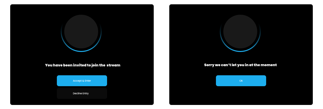
The “Knock Feature” modal allows viewers to request participation in a live broadcast. Integrated with a notification system, it keeps users informed about their queue status, whether they’ve been added to the stream, rejected, removed, or if they choose to exit the live session.
User Controls & Vault
Re-designed
Within this framework, I designed a visual solution for the creator’s private content vault. Creators are equipped with tools to customize, edit, and manage posted content, including the ability to remove it from the featured cycle or set access expiration dates. Members are provided with a parallel interface, though with limited controls to ensure content security and creator autonomy.

