Bates&Bates Identity System
Summary
The Bates&Bates branding system took its cue directly from the founder. “We are not another law firm” B&B is a female owned and operated partnered IP and contract law firm. They are eccentric firm that isn’t afraid to express themselves in their work, their space and their stance in the marketplace.

Color Pallet

In building the company’s color system, it required I get to know the person behind the name. Understanding her vision, what she did and did not want her firm to reflect and what aspirations for the firm where the identity can have a color system that is anything but, law but, something ReDefined.
Stationary System
The stationary followed the design story of modern tailored suit. With sharp lines, minimal and infusing modern colors such as lavender; signifying a young group of modern lawyers.
Stationary was digitized for Google and MS Word template use vs, printing an inventor, the law firm was able to produce their own high quality stationary using their in house printer and stock as needed.

ONLINE
The Bates&Bates inception website was created in what then was flash now HTML5 jquery where we wanted to make B&B just another law firm but, a strong, eccentric legal marketplace.
Digital Broshure
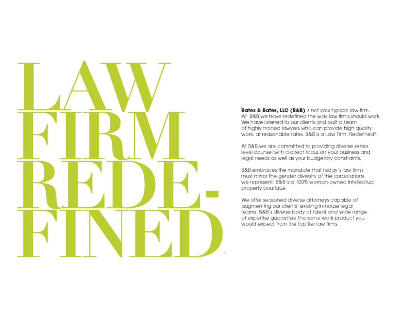
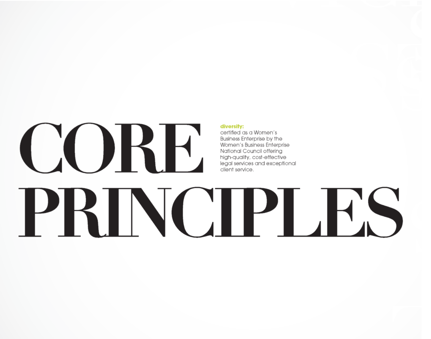
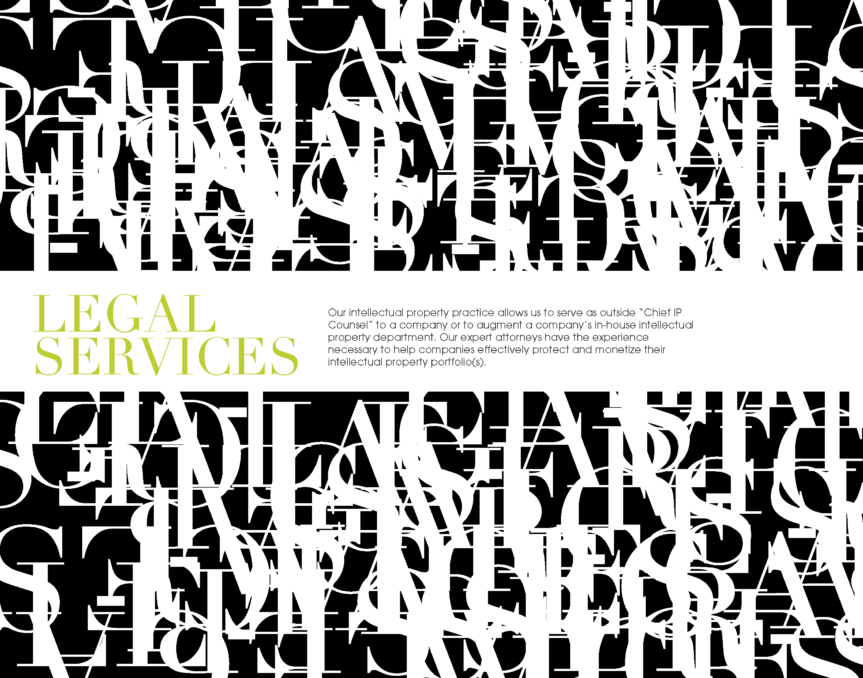
In establishing’s Bates&Bates’ brand personality, I incorporated some traditional law characteristics such as the serif font choice, married with modern style applications and using typographic design treatments vs photographic due to the nature of the brand, and it kept the brand’s identity timeless and youthful.
Interior Space Design
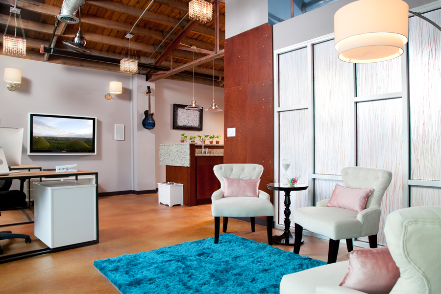
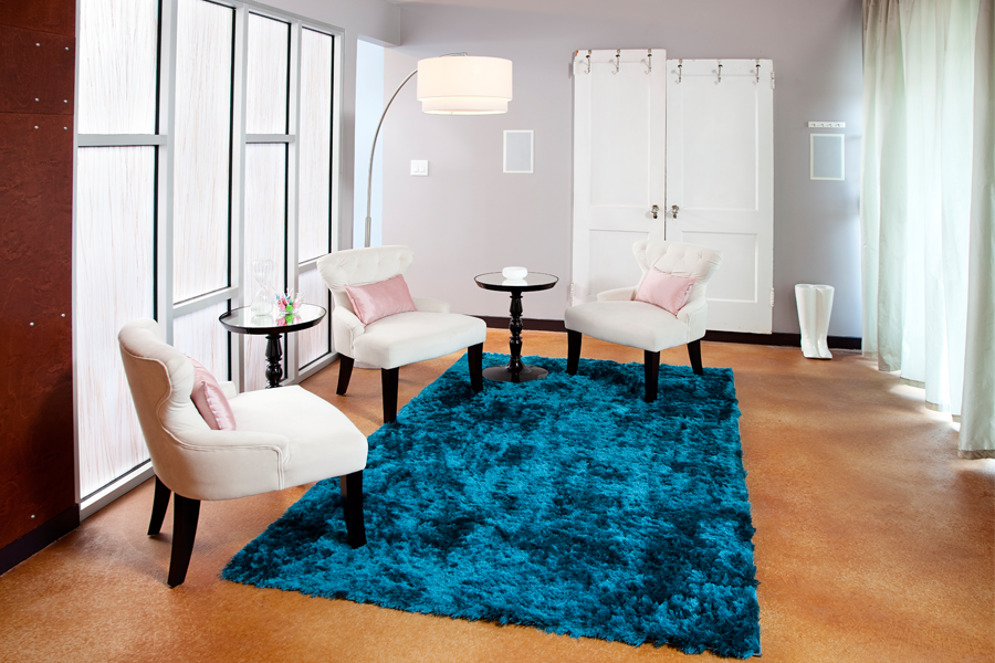
During the startup phase of B&B I was commissioned to take my graphic concept and marry it with interior decor. I drafted a design pallet that was unapologetically woman, sophisticated shabby chic for the workplace. The decor wanted to be more than a just an office but, feel like the living room you wanna work in.
Supporting Notes:
Pillows Curtains: Greg Brown
Frames: Kat
