


Rokit Brand & Style Identity
(Viewer's Discretion Is Advised)
Summary
Rok!t Products is an adult personal care manufacturer brand created to produce premium quality products for cost-conscious consumers. Rokit is more than just another adult product company; Rok!t is a platform to help drive real and honest dialogue within people that may not feel comfortable engaging in sexual conversation or extended education about sex and sexuality.
Brand Expression System
Sex and the conversation of sexual activity are still largely treated as taboo conversations. I want to celebrate individuals’s diverse backgrounds, body types, and sexual articulations (a person’s physical story). By leveraging personal stories (including my own), creating an honest visual and narrative story that paints a long, true image of the many ways we express ourselves sexually while creating dialogue with brain-staining visuals that are reflective of the sexual story of us. How Rokit is part of those stories.
Messaging
Rokit is a personal care lifestyle adult lubricant brand designed for a youth-centric, cost-conscious audience that is designed to be modern, fun, and reminiscent. Part of making the brand product unique is how it’s narrated. Rokit’s brand narration has an “empathetic flirt” tone about the product who it stands for, being forward and bold about it. It allowed us to craft a tone and messaging system that allows the product(s) to come across as approachable well explained while not being exclusionary.
The expression of this concept wants to be:
- Reminiscing
- youth-centric
- empathetic
- modern
Unrelenting Pleasure
Speaks to Rokit being a product that will last long and not “give up” on aiding people to complete pleasure.
Why beat around the bush? The majority of existence, specifically human existence, is mostly because of sex. Most like sex, most want sex, but not many fully understand every little thing about sex and how it relates to them, nor are they willing to talk about it. Instead, they will act them out with anyone we sexually come into contact with.
Some excuses have been:
- “I feel silly talking about something so personal.”
- “If I want to know, I can look it up or ask my doctor.”
- “I want products that would improve sex. Who doesn’t? But talking about it, I’ll leave that to the professionals.”
- “I would talk more about sex and ask more of products if I felt like I was taken seriously and not shamed.”
- We want individuals to feel comfortable that the product is reliable.
- The messaging is reflecting a real voice
- Using humor and flirtation to drive essential messages without coming across as arrogant, elitist, or without consideration
- It should be bold and brash yet approachable enough to feel like you can flirt back using bold sex statements that imply a visual reference that is clever enough to communicate to the audience. Yes, we have been thinking what you have been thinking.
Brand ID
Rokit is more than just products but a brand story that generates dialogue. I felt it was important to create a platform that embraces people of all diverse sexual identifications, body types, open perspectives of beauty, and sexual expressions.
I felt it was cool to leverage primary colors that we traditionally look at as “red/pink” for girls and trigger the brain to pay attention to alertness, hunger, or sex, while “blue” symbolizes boys and can trigger calm and coolness. The type of treatment and ID is reflecting on the 60s, which is said to be the decade of free sexual expression and love, but re-realizing what that moment would look like today.
Technical Notes:
Color Profiling – Coolers
ID—Illustrator


Printed Communication Devices
My idea of the collateral design system was surrounded around flirting with literal words that tastefully articulate the brand, actively engaging the viewer. In styling the business cards, specifically, I thought about the cards like I would my wardrobe; each card has a different yet unifying design expression to compliment:
- a style
- a conversational moment
- a personalized follow-up with notes
- a positive connection
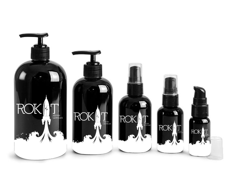
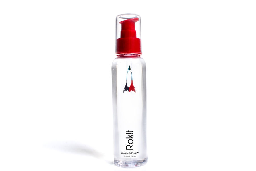
Bottling Label Release
Trial & Error
When working on a labeling convention that would best feature the brand’s personality, there was much to consider when executing this product label. Things I considered when publishing the Rokit product label:
- Container Sizes vs. Art Space
- Back Labeling for legibility
- Visual effectiveness and brand awareness
- Cost for production MOQ & application


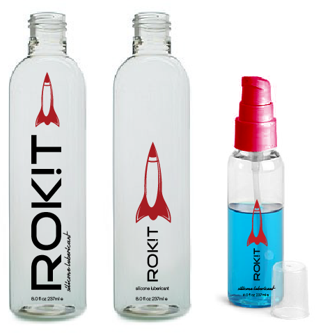
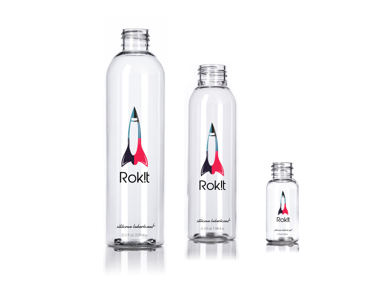


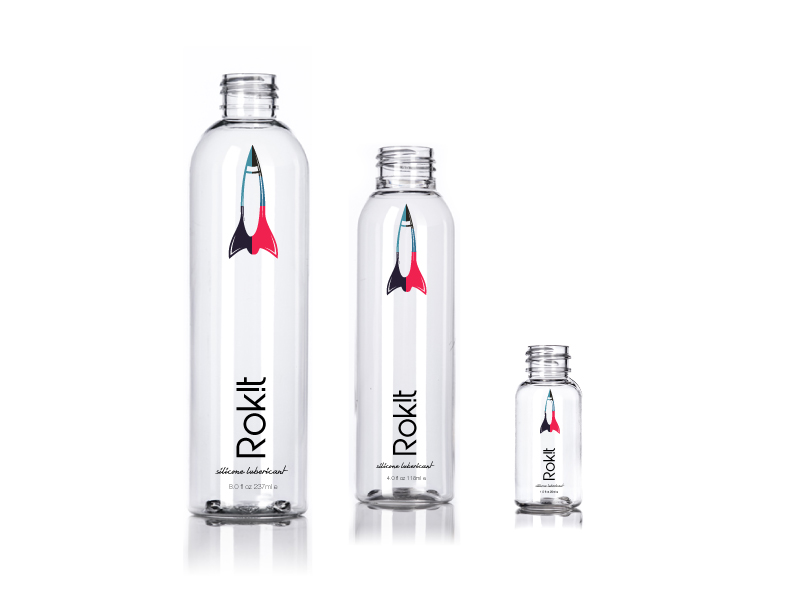


MVP Release
Selecting style 7 out of 12 tested highest out of other designs. Some factoring items noted in user feedback were:
- “This style seems timeless”
- “The design felt like you have more design freedom with it”
- “I like the design ambiguity in it not looking or feeling like one gender.”
Each bottle came finished with:
- Laser-printed label with a mirrored backing label allowing the user to reflect the colors of the product’s environment. Visually, it offers a unique retail shelf reflective appeal, grabbing a shopper’s passing eye and reflecting the person’s clothing or skin/environment, creating more depth in user connection.

Hotel Pleasure Kit
Part of promoting the MVP product was coming up with unique market positioning and strategies that would create niche revenue streams increase consumer accessibility and market buy-in.
Creating a simple, clean, yet discreet packaging that can be sold in hotel retail centers, travel destinations, and transportation centers.
Each kit came with:
- A 1 oz bottle of Rokit
- 2 Condoms
- 2 XL wipes by ‘After’
Sample Influencer Kit
To gain mass sustainable brand buy-in and as an investor engagement tool, I created a “preview/sample” box that would include:
- 1 oz bottle of Rokit
- 1 After HAS (human ass size) size Wipe
- 2 Condoms
- Brand & Product Overview Card
- Promote the market cheat sheet.
This preview box allows recipients to get a step-by-step walkthrough of the product and its growth plans while engaging the user to interact with the product to best understand, promote, and invest in the product.
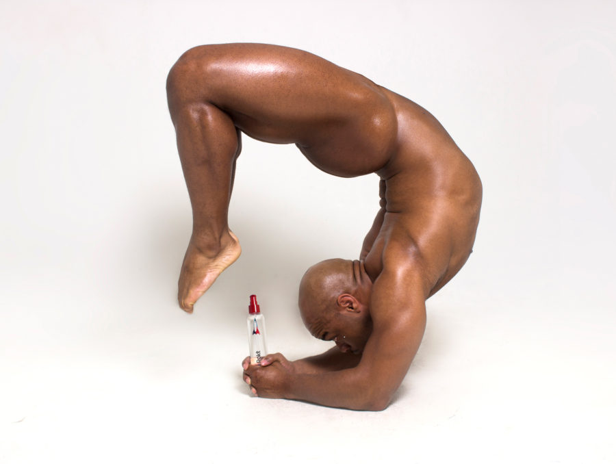
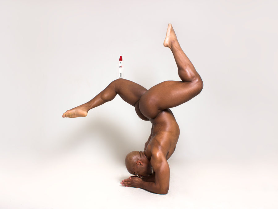
Promotional Visuals
Direction
Technical Notes:
Photoshop—Photo adjustment
Lightroom—Post Lighting Adjustment
Support Notes:
Photography: Ty Xavier Turner
Social Media Engagements
In selecting visuals to complement the brand’s social post, it was to understand the market’s conversation towards adult personal care products and not just publish randomly but publish with purpose, education, and creating the brand’s social atmosphere. I leveraged the style stories of the individuals in the advertising but created a space that would best show off the eclectic, influential breaths of Rokit’s style story.