


Rokit High Brand & Style Identity
Summary
Meet Rokit High, the sister brand of Rokit, revolutionizing moisturization with cannabis. My THC + CBD-infused silicone alternative is designed for all genders, crafting an unrivaled sensory experience. Relish heightened sensations, alleviate discomfort, and unlock euphoria. Like Rokit, its premium approachable identity sets the product apart, marrying sophistication with accessibility. Elevate your skincare with Rokit High and embark on a transformative journey of well-being.
My process for Rokit's
Brand Expression System
Starting with a comprehensive market study, I embarked on crafting Rokit High’s unique brand narrative. Fueled by this research, I meticulously wove together a visual tale of euphoric pleasure. Leveraging Rokit’s visual cues, particularly the emblematic “peacock on high,” I unified a cohesive visual language.
Each element of this language intertwines seamlessly, a deliberate symphony of strokes, hues, and details. Like a peacock’s feathers unfurl in splendor, our visual system unwraps, encapsulating the transformative essence of Rokit High.
My role in creating the
Messaging
Unleashing Rokit: Embrace Your Expression
Rokit, a groundbreaking personal care brand, empowers a youthful audience with modernity and nostalgia. My goal is to boldly step beyond taboos, celebrating diverse stories of sexuality and expression, even sharing personal experiences to foster dialogue.
Vivid Visuals, Bold Narratives:
My visuals echo the mission, etching memorable images that mirror the spectrum of human sexuality. Rokit’s “empathetic flirt” tone engages openly, creating an inclusive messaging that’s both informative and inviting.
Nostalgia Meets Innovation:
Rokit captures the essence of eras, merging nostalgia and modernity into an atmospheric, retro-modern vibe. I am rewriting narratives, embracing unique stories in a space where reminiscence dances with bold revelations.
Join Rokit’s journey, where each story enriches our tapestry, taboos are shattered, and individuality finds its voice through this visual story.
Play euphorically
The statement embodies what Rokit High does at its core. To support individuals in achieving their highest, most pleasurable experience.
Why beat around the bush? The majority of existence, specifically human existence, is mostly because of sex.
Some excuses have been:
- “I feel silly talking about something so personal.”
- “If I want to know, I can look it up or ask my doctor.”
- “I want products that would improve sex. Who doesn’t? But talking about it, I’ll leave that to the professionals.”
- “I would talk more about sex and ask more of products if I felt like I was taken seriously and not shamed.”
- We want individuals to feel comfortable that the product is reliable.
- The messaging is reflecting a real voice
- Using humor and flirtation to drive significant messages without coming across as arrogant, elitist, or without consideration
- It should be bold and brash, yet approachable enough to feel like you can flirt back. Using bold sex statements implies a visual reference that is clever enough to communicate to the audience. Yes, we have been thinking what you have been thinking.
Brand ID
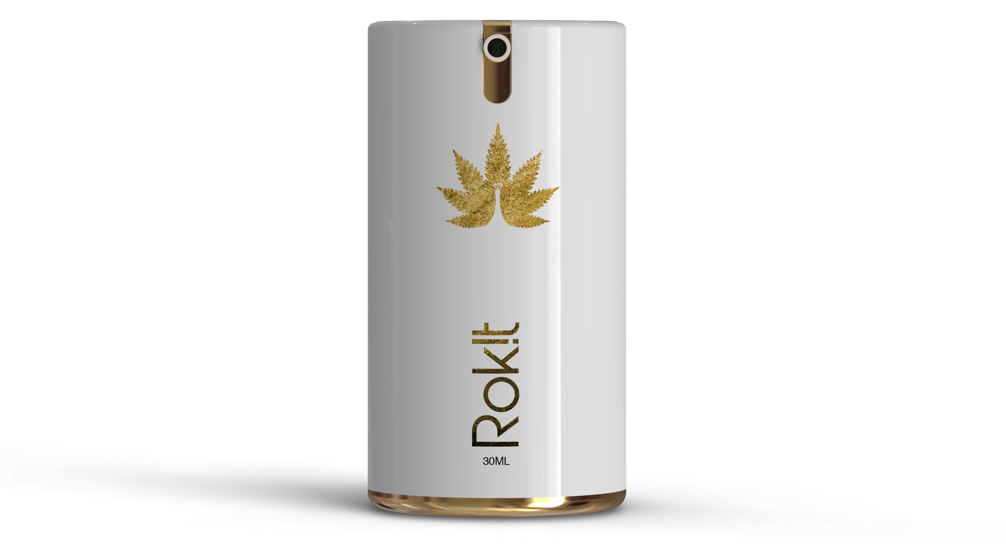
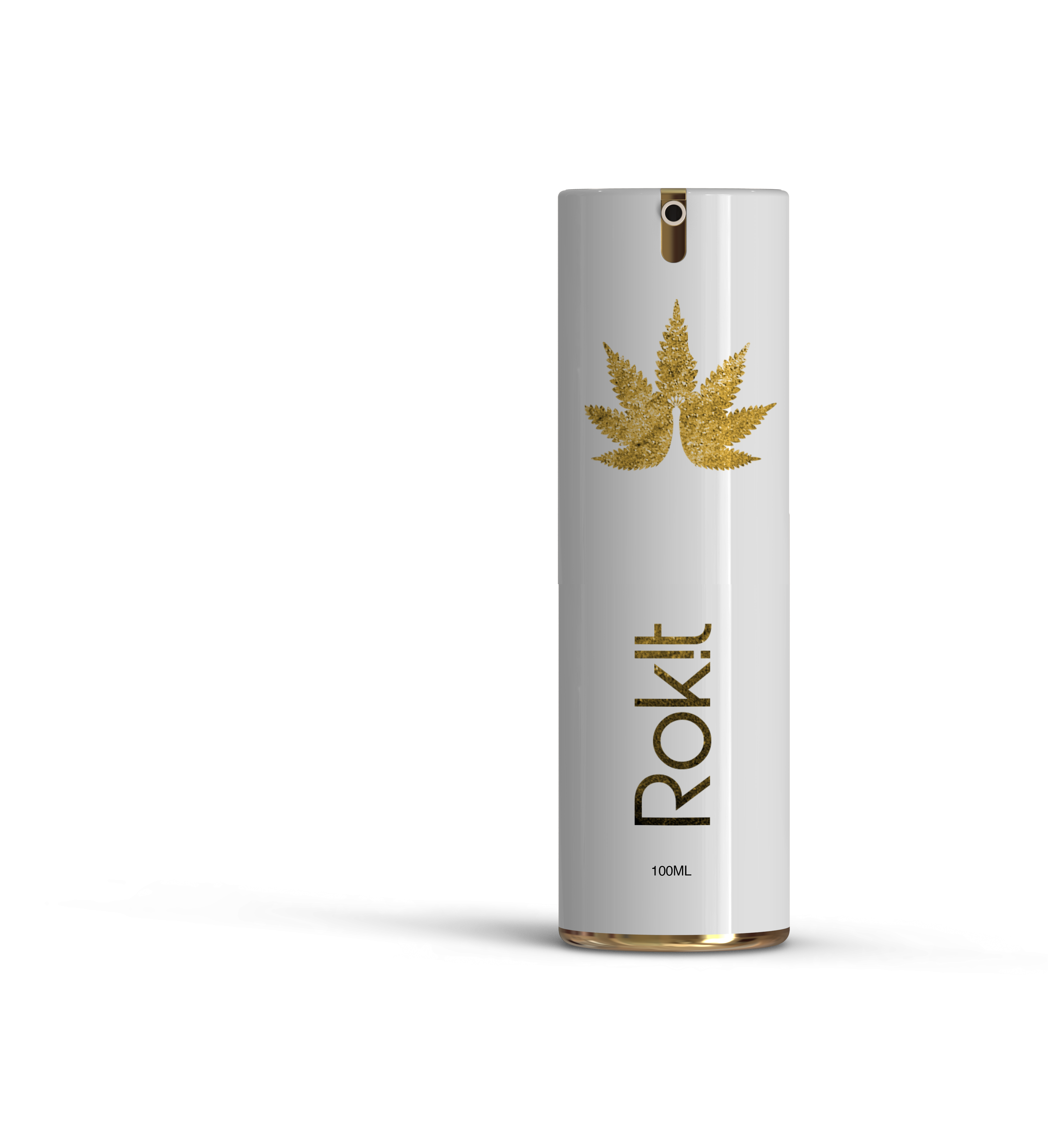
Rokit High: A niche personal care moisturizer infused with THC, CBD, and terpenes.
Rokit High’s platform welcomes all sexual identities, body types, and expressions of beauty. I use primary gold and white colors, complementing its parent brand, Rokit.
Technical Notes:
Color Profiling – Coolers
ID and TypeMark—Illustrator
MVP Release
Rokit uses airless PET bottles, opaque, for longer product freshness and ease of use. Creating a label for this particular bottle style adheres to the parent brand Rokit by keeping the design minimal yet visually expressive and complementary to the brand’s ID.
Promotional Visuals
Direction
Elevating Connection Through Modern, Playful Imagery
Our brand’s visual pitch resonates with contemporary, vibrant aesthetics that capture the essence of anticipated connections. The journey to bedroom bliss begins with acts of recognition, observation, listening, and feeling—a celebration of shared experiences, whether with a partner or oneself.
Technical Notes:
Photoshop—Photo adjustment
Lightroom—Post Lighting Adjustment
Photography: Ty Xavier Turner