

BMW Map Update Premium 2008 - 10
Project Summary
Client’s Objective:
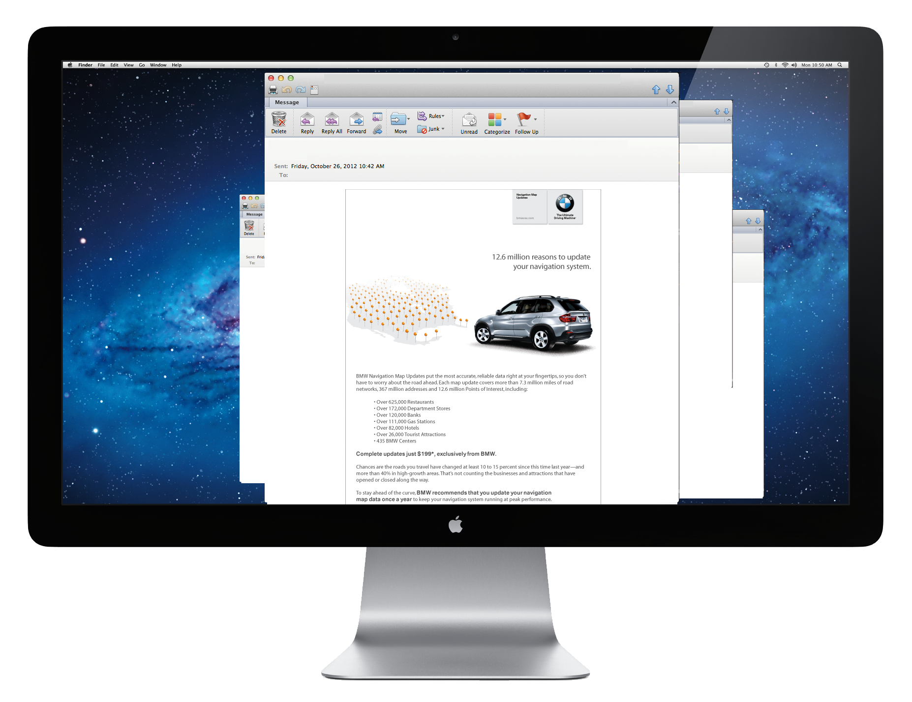
TomTom (formerly Tele-Atlas) conducts yearly or bi-annual map updates for legacy BMW vehicles. In this endeavor, the client aimed to spotlight their improved points of interest data for the navigation system. Tele-Atlas had three key objectives to amplify BMW Group’s navigation progress: ensuring precise driver guidance to destinations, alleviating street congestion, and enhancing routes for efficiency.
Solution:
In coordinating with the team on a visual execution that fit within BMW’s then style guide of clean white negative space, I helped isolate the car to focus on all of its beauty. For each deliverable, I prioritized creating complementary visuals that matched various points of interest, ensuring consistency across formats. To align with the transport theme, I curated single elements representing barriers to a driver’s journey, reinforcing the campaign’s narrative. I expanded this storytelling across full-page ads, in-store signage, targeted banner ads, email campaigns, and car owner mailers—all part of a cohesive 10-week activation program.
.
Role:
Hands On
Vector Illustration
Packaging Design
Channel Adverts
Visual Inspiration
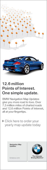
My creative spark ignited from a map pinpoint icon, propelling me towards a visual system that vividly illustrates the enhanced driving experience offered by BMW. Driving a BMW opens doors to fresh adventures and broadens customers’ horizons.
Print Publications


Collaborating with the team, we orchestrated a visual presentation that aligned seamlessly with BMW’s prevailing style guide, emphasizing clean white negative space. By isolating the car, we directed attention to its exquisite features. With each deliverable, it was crucial to craft complementary visuals that were visually simple, mirroring the straightforwardness of the cascade of points of interest. To maintain the transport theme, we curated singular elements symbolizing obstacles to a driver’s journey toward their destination. This approach amplified the narrative encapsulated in the full-page ads created for a 10-week rotation.
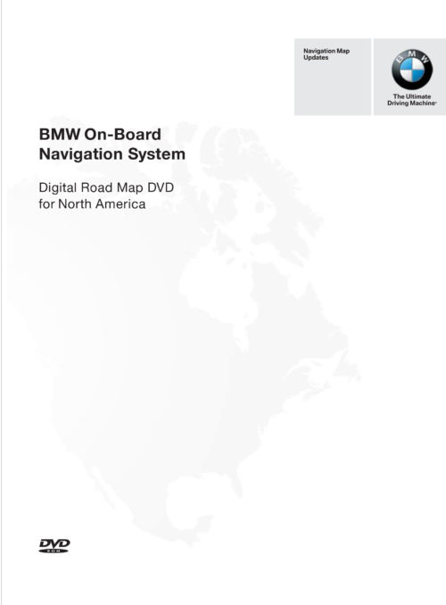
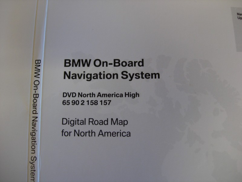
Map Premium Packaging
Upon purchasing a map update DVD, vehicle owners received a DVD tailored to their intended destination, resulting in the creation of multiple DVDs based on regions. To streamline this, a color system was incorporated into a contemporary packaging design that, like the advertisements, prominently featured negative space.
Technical Notes:
Illustrator: Vector elements, Map Highlights and Die Lines


E-Commerce Intergrated Page
Within this context, the layout had to conform to the existing digital style guidelines of the BMWusa.com website at that time. While the layout remained straightforward, it required a visual element that could break through the monochromatic design, capturing the attention of traditional web viewers. To address these layout constraints, we employed an image using primary colors, effectively resolving the challenge.
Technical Notes:
Sketch: Microsite Website UI insert

Online Ads
To ensure consistency in visual coherence across all deliverables, certain visual choices were made to guide the viewer’s eye and establish a parallel connection to the visual message, ultimately reinforcing the call-to-action.
Technical Notes:
Photoshop: Map Effects
Dreamweaver: Email Layout
Sketch: Banner Advertisements