Project Summary
ivWatch, is a med tech startup company that sought to update and develop their initial brand ID, messaging system and brand design expression system to support global collateral that meets FDA requirement.
Color & Style Direction
The idea developed was to create a patient-conscious, mission-critical visual story that would appeal to a large, diverse medical audiences while being completely keen that all design direction needed to be functional medical use. In establishing a developed color system, leveraging the device’s color system and elaborating rather than replacing the establishing color system.
The over all style of ivWatch’s visual narration was to scale back the very graphic realities of infiltration visuals and lean into a visual narrative that focuses on preventative care and the diverse faces of whom ivWatch’s promises to protect vs. showing visuals that detours from digesting product’s overall promise and offer to the marketplace by using graphic images.

Brand ID
In updating the ID Mark; I leveraged the mark from the source designer, updated the color to become a flat 1 color application and perfected the line art’s shape to use in minimal and mass scale applications.
Technical Notes:
Adobe Illustrator – Identity Mark
Initial Identity


Updated ID Mark
Icon Marks

Updated Color Story
One would say healthcare changes as fast as the beating heart. Elaborating on ivWatch’s existing color system; I brought in red, yellow, and light blue from the product’s UI; inviting bolder color freedom to tailor to a diverse audience while balancing those colors with warmer inviting colors to instill calmness, humanity and persistent attention.
ivWatch Updated Design Story
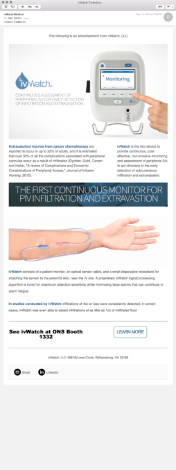
In evolving the brand’s color language to a more diverse color conversation system; it afforded liberties in how the company’s social media communications presented. The visual narrative of ivWatch’s updated digital collateral has centers around the label system. In organized chaos world of hospitals; in some small yet significant way, proper notifications like ivWatch provides its role in the complete care of all.
Technical Notes:
Figma – Social design and mock animations
Adobe Rush – Quick video transitions
For more information about this project HMU, invite me to an interview
Product Photo System
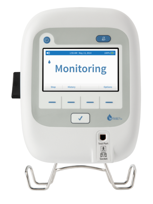
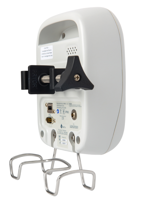
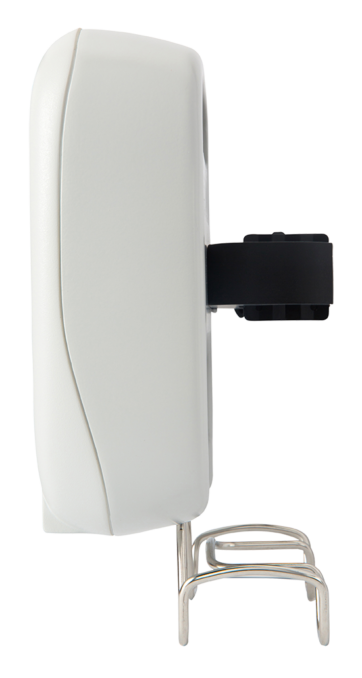
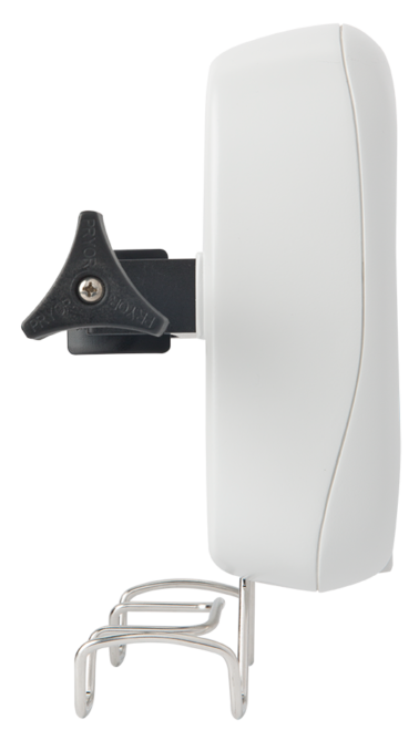
When shooting a product, I feel it’s a good idea to capture the product in all of its key features, angles, and perspectives; even I didn’t need ’em at the time; I find myself needing them later or the art director would greatly appreciate the considered support.
Having an internal library of visuals of a product allows for unpredictable layouts, expanded brand personality and screen status updates without reshooting during the lifecycle of the product’s body style.
Contributing Photographers:
Steve Cole
Tyran Weldon
Patrick Heginey
Messaging System
In creating a tone for and messaging system for ivWatch was understanding the product and the nature of where it resides in the healthcare system. In exploration of building, a tone was defining the line between care and CAUTION. Part of ivWatch’s deeming was in initial presentation it communicated as if it was part of an “automated replacement” to parts of clinicians jobs, implying there were incompetents in their work efforts.
The product and brand was shifted to create a defined narrative that the product was an ally, an assistant, a “solution” to what starts as a small problem that leads to a large issue.
Credit Note:
ACD – Copy: Josh Cannon
Operation Manual 1.0
In this application it was key the formatting, use of color and legibility was key to executing a digital document approved by the FDA act as an operational and technical resource in medical facilities.
Tech Notes:
Layout – Adobe inDesign
Photography – Stock w/ Photoshop
Product Overview
To get a better understanding of the product; the idea of creating an overview video that would allow users to get a high level overview of the promise of the upcoming IV monitoring patient device. The video leveraged the still photo collection created for this particular instance.
At the time, ivWatch did not have video product b-roll recorded for media use. The only option to execute this 4 day ask was to leverage the still to compile a compelling, modern presentation that expressed a hopeful new med tech product to the industry.
Initial Tradeshow Design
ivWatch’s first AVA booth was a simple design I felt we didn’t need to “throw the kitchen sink” to the over all communication station; keeping with a clean, minimal design allowed us to highlight key features and focused on driving the message and gathering real time feedback on how the presentation was received, so future presentations can evolve to serve better as the product scales in the marketplace.
To compliment the booth’s overall communication structure, I included a TV that looped visual features of the product and on the floor I added a iPad, paired with headphones, for visitors to get an immersed explanation of the device. Adding the iPad allowed booth attendees to have various areas to digest information, so it didn’t overwhelm the presenters at the boot.
ivwatch.com
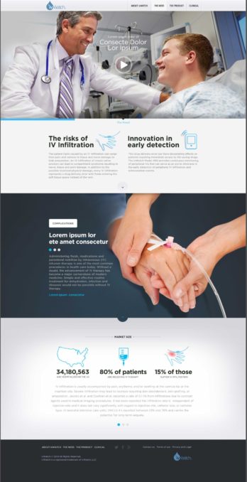
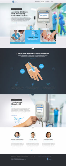
This was one of the initial presented UI design sets to show the full brand visual online with creating interactive product walkthroughs, simplified messaging globally while focusing on a defined style expression that allowed for modulated scaling as the product and brand story grew.
Tech Notes:
Photography – Stock w/ Photoshop
Illustrations – illustrator
UI Visuals – Sketch w/Abstract


